
OUR CREST
OUR CREST
A CREST FOR ALL RHODE ISLAND
A CREST FOR ALL
RHODE ISLAND
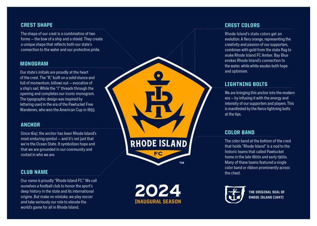
Our crest is authentic, bold and unique. It should be worn proudly by all Rhode Islanders as a symbol of state pride and love for the beautiful game. It is a crest that stands unique in the North American soccer landscape and is proud to be a part of the USL Championship.
Rhode Island creative agency NAIL designed the crest after numerous listening sessions, surveys, community engagements in Rhode Island, and extensive historical research through American soccer historians and local archivists. Our crest embodies many of the themes and concepts discussed in depth with Rhode Islanders who represented a diversity of experiences and cultures. Those themes include:
- Rhode Islanders’ love for all things state colors, flag, and seal—even their license plates
- The anchor symbolizes hope and being grounded in who they are
- Independent thought, communal action
- Rhode Island’s connection to the water, both rivers and coastline
- Rhode Island’s diversity and desire for inclusion and community
- The historic roots of soccer in Rhode Island date back to the 1800s
- Rhode Islanders’ salty personalities… you know it
- Rhode Island’s shared passion for soccer, fútbol, futebol, calcio, bóng đá or football, most commonly referred to as the world’s game